Dopamine Dressing 2026: Mastering the Blue, Pink, and Orange Palette
Have you ever felt like looking at a color and can’t help admiring it? This felling like I want this in my clothet, but in the time it seemed to much color ? Relax, here are some specific rules for mixing these color palette and make it more for you
1. The "Complementary Clash" (High Contrast)
These are pairs that sit opposite each other on the color wheel. They create the most visual "vibration" and energy.
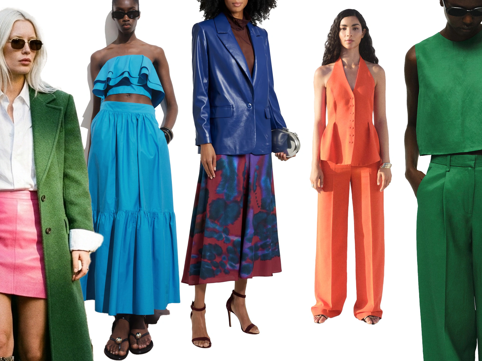
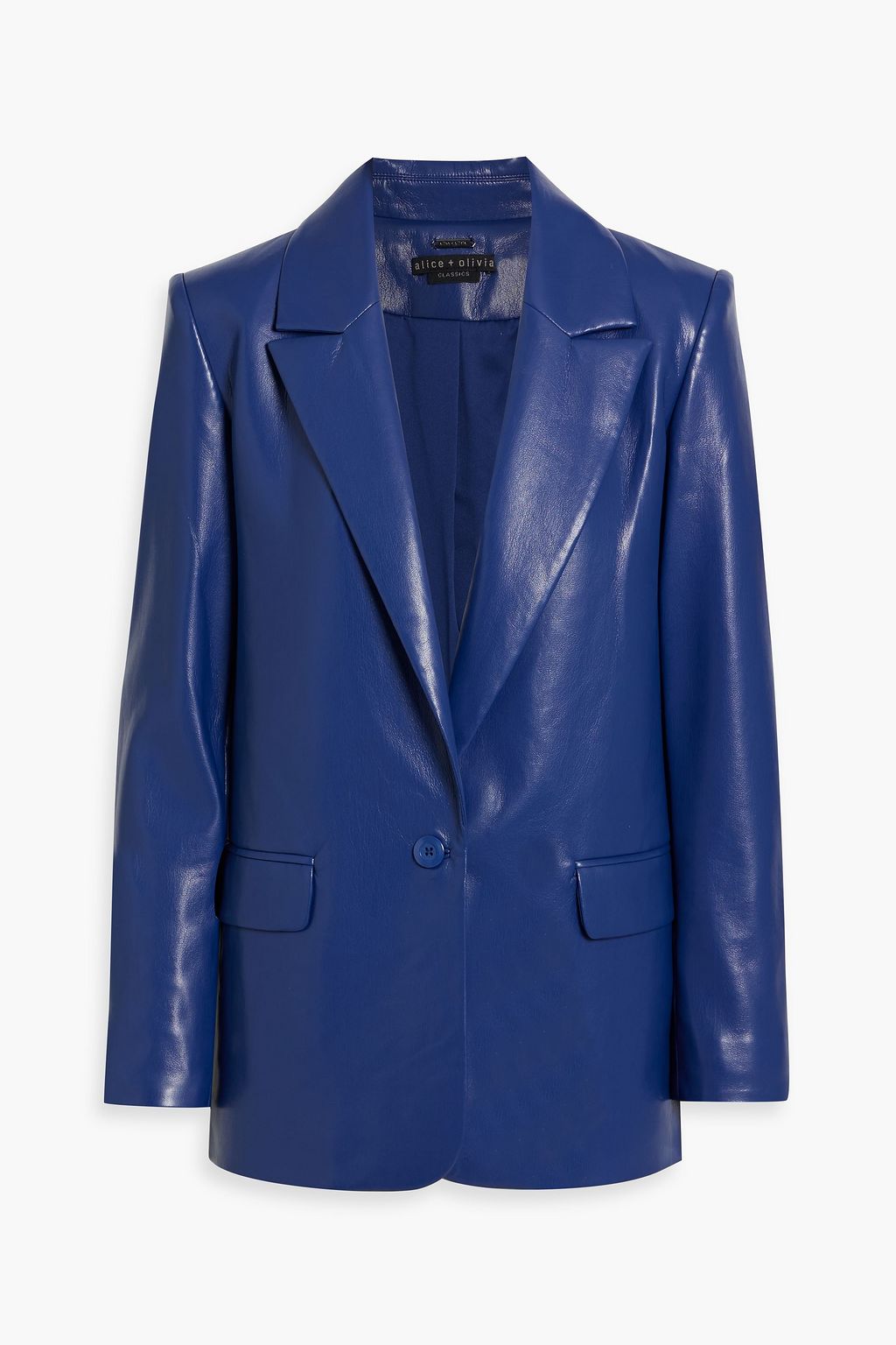
Blue + Orange: This is a classic. Because Blue is cool and Orange is warm, they balance each other perfectly. Rule: Use a dark Navy Blue with a burnt Orange for a sophisticated look, or Cobalt Blue with bright Tangerine for a sporty, bold vibe.

Red + Green: Avoid the "Christmas" look by playing with shades. Rule: Instead of primary red and green, try an Emerald Green with a Pinkish-Red (Magenta) or a deep Forest Green with a Burgundy.
2. The "Sister Shade" Rule (Analogous)
This involves pairing colors that are cousins—they sit next to or near each other.
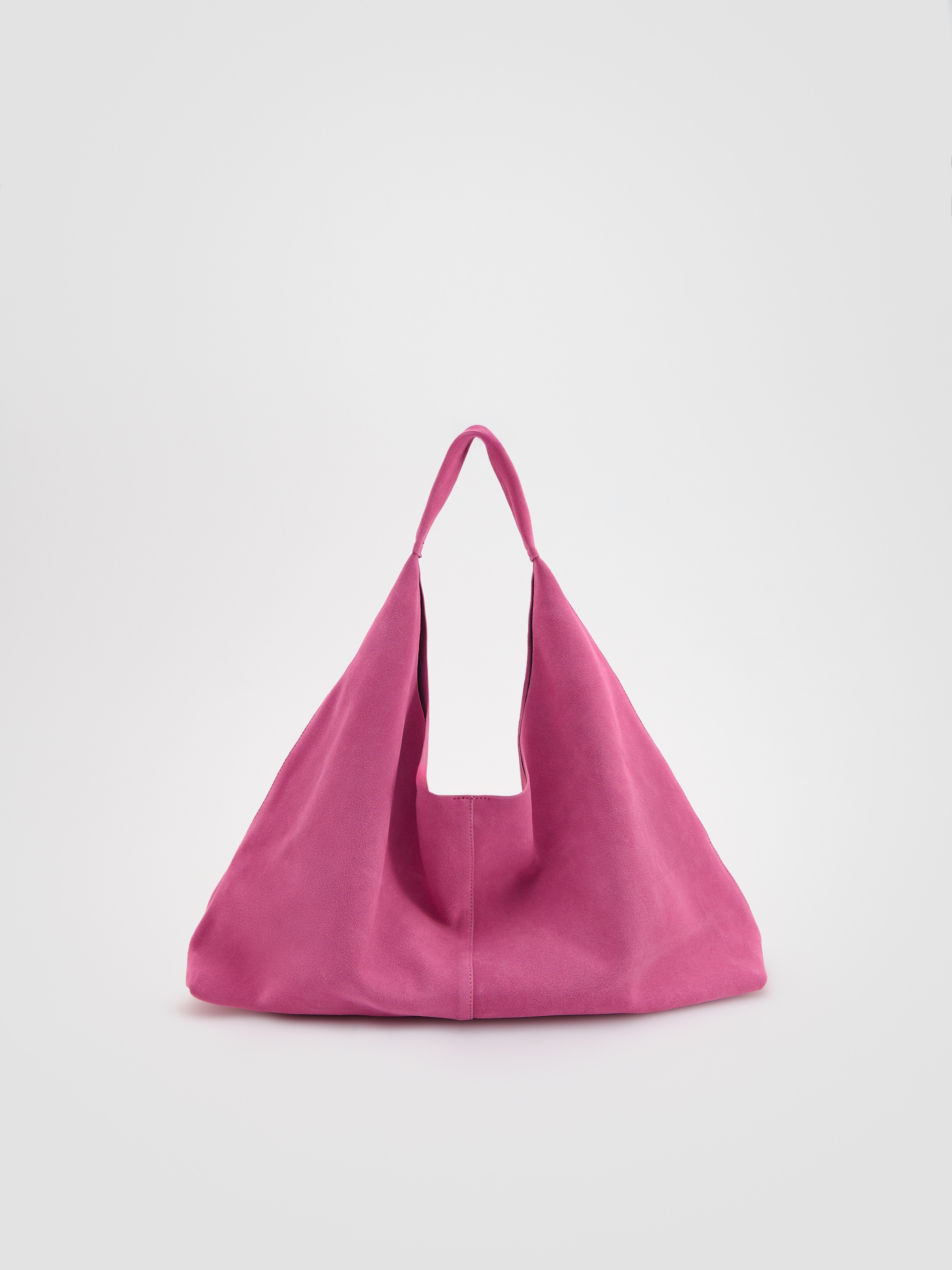
Red + Pink: Once a fashion "don’t," this is now a major trend. Because Pink is essentially a lighter version of Red, they look harmonious. Rule: Keep the "saturation" the same. Pair a neon pink with a bright red, or a pastel pink with a muted cranberry.
Orange + Pink: This creates a "sunset" palette. Rule: These are very high-energy. Ground them with a gold accessory to bridge the two warm tones.
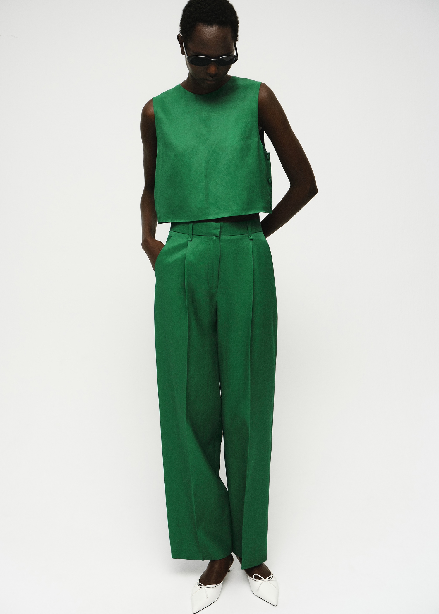
Blue + Green: This is a "cool" harmony. Rule: A turquoise blue with a lime green feels fresh and summery, while navy and forest green feel moody and expensive.

3. The "Power Trio" (Triadic)
If you want to wear three of these at once, use colors that are evenly spaced.
The 2026 Trend: Sky Blue + Emerald + Orange. This specific combination is trending for the upcoming seasons.
Rule: Use the 60-30-10 ratio here. Make Blue your base (60%), Green your secondary (30%), and use Orange as a small "pop" (10%) in your shoes or bag.
4. The "Temperature Bridge" Rule
With this specific list, you have a mix of Warm (Red, Orange, Pink) and Cool (Blue, Green).
Rule: If you are mixing a warm and cool color (like Pink and Green), ensure they have the same intensity. A neon green will "kill" a dusty pastel pink. Match "vivid with vivid" or "muted with muted."
5. Using "Neutral Anchors"
When mixing these five specifically, the look can quickly become overwhelming.
Rule: If you are wearing more than two of these colors (e.g., Pink, Orange, and Blue), use White or Cream as a "cleanser." A white t-shirt between a pink blazer and orange trousers creates a visual "break" that makes the colors look intentional rather than accidental.
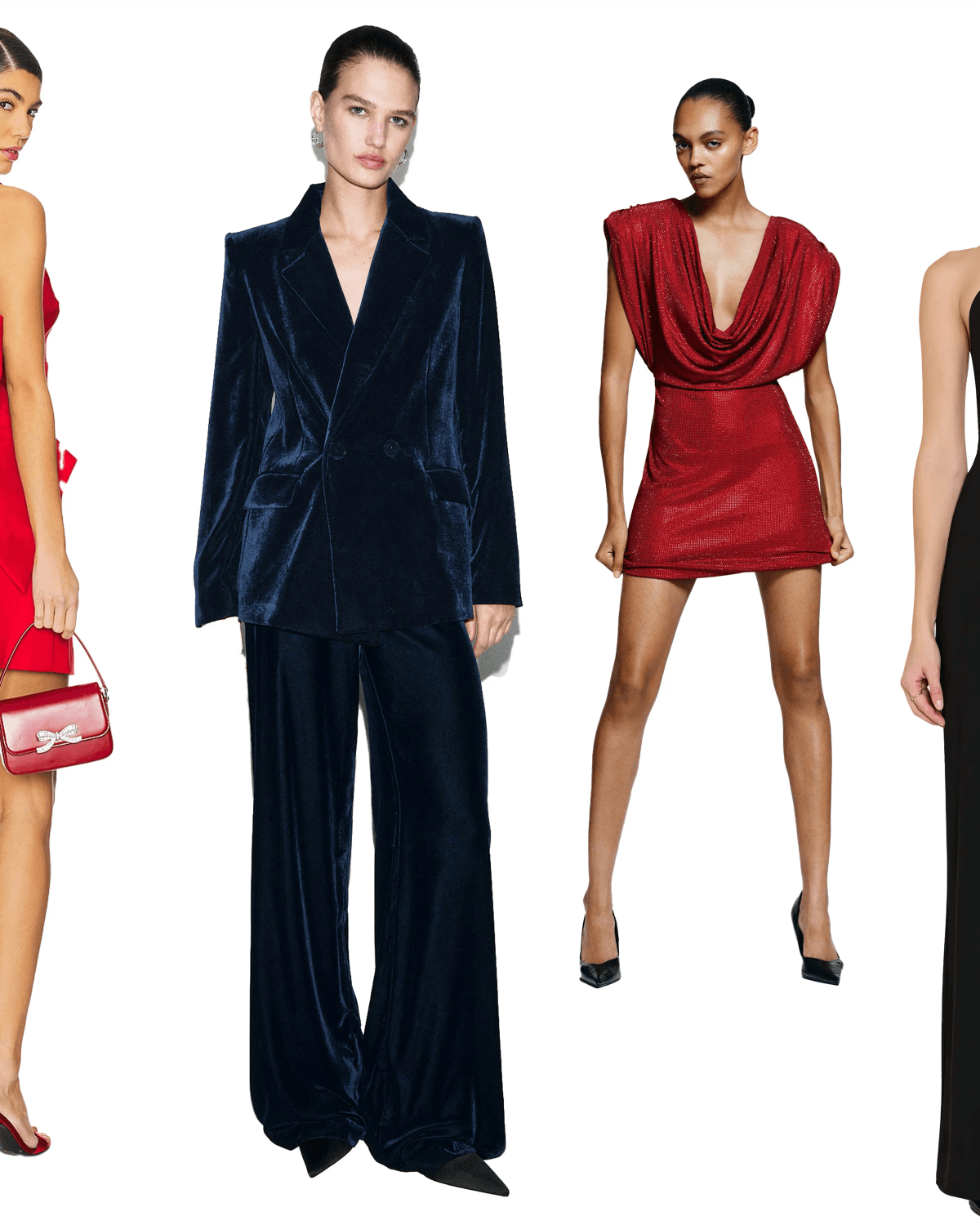
Here are some very interesting position you may add to your style.
 |  |  |
The Edit.
Weekly curated design & culture.
You Might Also Like
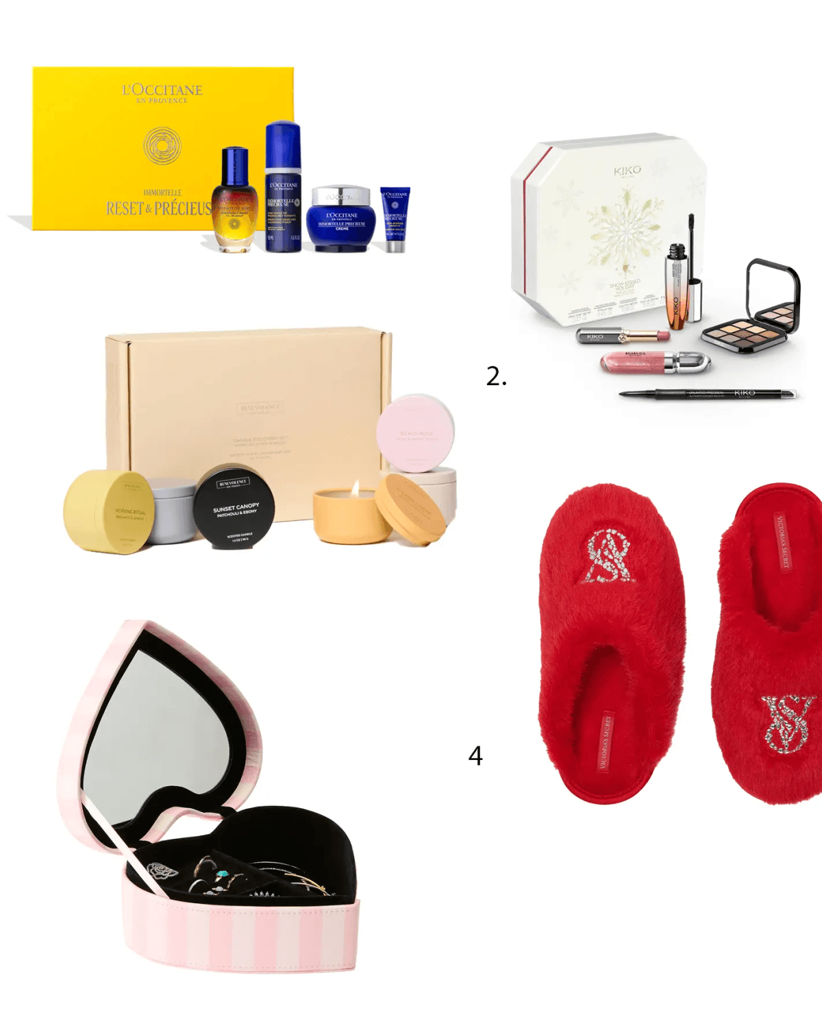
January 2026 Wish List: The 5 Pieces I’m Obsessing Over Right Now
I don’t know about you, but after all the holiday glitter and sequins, I’m feeling...
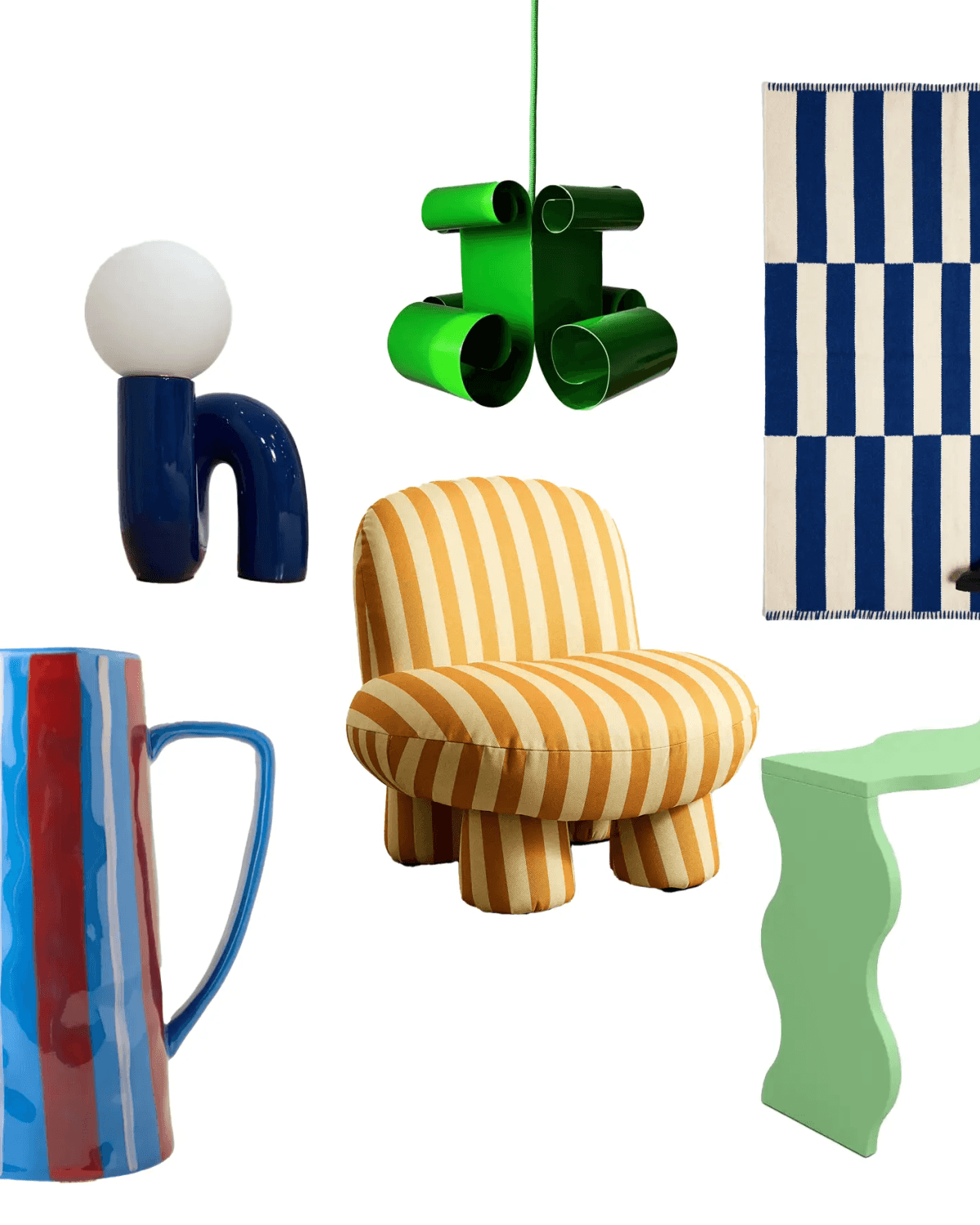
Let's talk about trending Fun Haus home design
Wow!!! Forms, colors, palettes are more than impressive in this Fun Haus home desi...
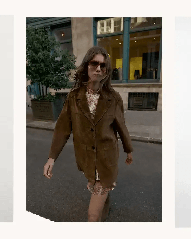
5 New Year's Eve outfits you might still looking for
The countdown is officially on, and it is time to get excited for the most magical...